


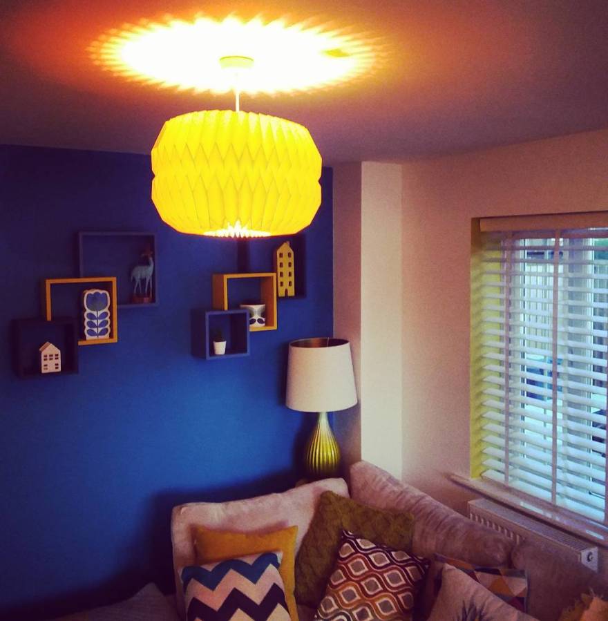


And welcome to my living room! It’s a sunny room, with 2 windows on different walls, which helps this to be the light, airy space that it is. It also happens to be my favourite room in my house. There are lots of squares aren’t there? Hmmmm. This wasn’t a conscious decision by any means! I suppose I’m a big fan of symmetry. That dates back to Spiragraphs as a child. Remember those?
The shelving units were picked up half price in a Next sale, years ago. They were a horrid, mock, birch effect things. Just cheap mdf really. So I put a coat of “sticks to absolutely anything” spray paint from B&Q (not it’s official name. Just what I call it!), allowed it to dry and then brought 3 tester pots of paint from Wilkos in colours that I liked. It wasn’t a particularly ‘thought out’ idea, but my best ideas never are. My living room at this stage had lots of green accents but I knew I wanted to fade the green out and run with blue and yellow. Well. Habitat Kingfisher Blue and Habitat Mustard if we’re being precise. Man I’m gutted they discontinued their paints. They were great! I’m usually very happy with Dulux but I strayed to Habitat once and didn’t regret it.
The blue Square with the Morgan Kane print in it was inspired by the shelving. I like how angular everything is but at the same time, it’s imperfect. I purposely wanted to place the print off centre just to add a bit of interest. I often like things that aren’t quite perfect, but they’re trying! If everything looks too symmetrical or ‘placed’ that’s when I find that design starts to look a bit contrived and staged. That’s when the “show home” look creeps in. I want my home to be a home, not a set.
Behind my ‘you look lovely’ mirror is a mustard triangle. I hated the line between the two a joining walls. One white. One mustard. It was too severe. There was no blend. It’s why I’m not so keen on feature walls. I like to try and blend the walls together in anyway I know how. So, I just started at the top corner and brought an angle down onto the white wall. I’d seen it on Pinterest and knew it’d be fitting in this room.
As for our stairs, that lead off the living room, I painted a faux bannister with the mustard that’s on the TV Wall and created a gallery staircase. It may look very “thrown together”, and I’d love to say it was, but unfortunately I did have to plan the placements of the frames quite meticulously. Nailing that many holes into the wall? I knew I had to get it right first time! This isn’t our forever home and I sometimes look at my stairs and think “the poor people who are going to buy this house are going to absolutely curse me!” for some of these decisions! 😂 Oh well. It looks great and I often feel that our stairways get quite neglected or seen as a mere passage to get from one space to another. I wanted to utilise it as it’s own, unique space. (And to stop the harshness of the blue wall meeting the mustard wall I placed a plant in the corner to break it up. Little tip there if these things bother you like they bother me!)
My teak sideboard was an Ebay find. A steal at £150. Over the years I’ve toyed with the idea of painting a design on it or putting some wallpaper on it. But I love it in it’s original form and would hate to somehow ruin it. I got it years before having a teak sideboard was “cool”. Not that I’m gloating! But usually when a trend takes off it puts me right off ‘said thing’ and I’ll turn the other cheek, not wanting to fit a mould or look like I’m following a heard. It’s just the way I am. But, I have an emotional tie to that sideboard because it was the first piece of furniture that we got when we moved in so I could never get rid of it simply because of my aversion to trends. It’s now a sentimental piece and I’ll have it forever.


